- Copyright - I have looked through my blog and found my own photographs and have not taken any from another photographer or from the internet.
- Issues of Confidentiality - I have not invaded anyone's privacy or used a photograph of them without their consent. Nor have I placed any of their information on my blog.
- Libel - I have posted comments on people's blogs but I have in no way defamed them or insulted them.
Monday, 24 May 2010
Legal Requirements when completing your blog.
Isolated Image.

 The original photograph is the first one, as you can clearly see I isolated the blue bells to emphasize them more, but I think they're harder to see on the isolated photograph. At first I started off by adding a layer but then when I went to isolate the photograph It wouldn't let me, so I had to take the layer off. Moving on from there I went to the sidebar on photoshop which is on the left hand side of your screen, where all the tools are and used the "Polygonal Lasso Tool" and moved it around the blue bells on the bits I wanted to isolate. Instead of using Hue/Saturation I used black & white, where you would find in Image> Adjustments> Black and white and used the cursors on there to emphasize the shading, I mainly used Magenta, Blue and yellow. The result is the last photograph.
Monday, 17 May 2010
Curves.


 This photograph is edited with curves, to find the tool curves I went to Images> Adjustments> Curves and a box should come up just like it's shown on the second photograph. I've uploaded the second one so you can see what it looks like so you don't get confused. I prefer the original version of this photograph because it looks elegant and pure, now It looks too edited and I just wasn't going for that look when I took this photograph. The look I was going for was the original version which is the first photograph.
White Dropper.

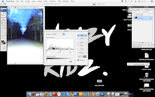
On this photograph I used White Dropper, to use that on photoshop you need to go to Images> Adjustments> Levels. It should look something like the second photograph when it comes up on your screen. The original photograph was very dark, you could barely see the pathway if Im honest, so the adjustments worked really well but I prefer how the original photograph looked. The sky was also a blue black color, but with the adjustments you can see the sky and that was not the point of the picture, It looked more mysterious and had an edgy feel to it.
Color In CAD, Black and White.

 Go to Image> Adjustments> Black & White and you will get the bar that has appeared on the second photograph. Adjust the colors as you want them, I print screened them so you could see what grades I wanted them to be at. This photograph was originally not In black and white, but the sky was a light blue, with white and a very soft pink, I definitely think that In black and white the affect is completely different than in color. In black and white it gives us a monroe feeling, it also looks like an old photograph and you can sense sadness in the black and white one, like there is no hope, but looking at the sky, it looks like something beautiful can happen.
Monday, 10 May 2010
Long Depth of Field.
 Believe it or not, I was standing very far away from this abandoned building but the zoom on the Cannon SLR was clearly very good for zooming in but not so much for zooming out. It was on automatic, so the aperture was set on it's own the shutter speed was set to 1/60 second though. I did edit this shot, I made it black & white because I felt it went well with the photograph, everything else is original.
 Converting to Black and White using Layers and Hue/Saturation

 I had to make sure I had layers selected, I went to Layers> New Adjustment Layer> Hue/Saturation. Then I clicked "Okay" to the new window, the next window I had to open up Hue/Saturation and reduce the Saturation to -100 then clicked "Okay". Then I clicked on Background in Layers palette> Go to Layer on the menu again> New Adjustment Layer> Hue/Saturation> In Mode: "Normal" to "Color" Then i clicked "Okay" In the layers window after I double clicked on the Hue/Saturation icon and in this window I changed the "Master" drop down menu to "Green" And that's how i got the first photograph, by changing the "Master" to "Green" Also when using photoshop I flatten the image so it can be saved as a JPEG and so it won't take up all of my memory.
Subscribe to:
Posts (Atom)
